Feature addition - Polls & Surveys
Product design at EmmetrosCompany overview
Emmetros is a company that offers a platform called SparxConnect for healthcare professionals' communication and care planning. The business has created a platform that helps healthcare professionals, caregivers, and patients communicate with one another. The platform includes patient care capabilities for healthcare providers, such as tools to track patients' progress; and for patients, such as timed delivery of education resources throughout their care journey. Before transitioning into the patient engagement space, the application helped with residential care and long term care where patients' families are connected with their care team and could easily share information related to their loved one to better their quality of care.
Project definition
As mentioned above this company transitioned into a new market: patient engagement. This shift required a deep understanding of a new group of users and their unique needs, as well as a thorough analysis of competitors in the space. While numerous smaller changes were implemented to meet these new requirements, one of the most impactful additions was the capability to send polls and surveys directly to users within the app. This feature has proven to be a game-changer, enabling better engagement and feedback from users.
My role
Designer alongside Jennifer K. and Madalayne R.
This project was a huge undertaking for the entire product team, as such the UX team worked together on many of the pieces to help see it through.
Final product
The process
User research + Comparative research
Lead: Jennifer K.
Support: Annelise V.
Starting with a comparative assessment of survey and polling platforms available in the market, we identified a comprehensive set of fundamental requirements that are imperative to be included in our solution, along with a supplementary set of nice-to-have features that would differentiate us from our competitors. Bearing in mind that we operate in the eHealth sector, we noticed that there are very few platforms in our niche that provide a similar functionality.
Based on the results of our analysis, we have compiled a list of prerequisites and initiated the process of delineating the features required.
Ideation, IA, and sketches
Annelise V, Jennifer K, Madalayne R.
During this phase, our team focused on gathering and analyzing all relevant data obtained during the research phase. We mapped out user journeys and workflows, and explored many ideas that we had seen in our comparative research. Upon defining the information architecture of this feature, other components began to take shape, thanks to the insights gleaned from the research. After several internal design review meetings, we reached a decision on a UI style and workflow that would be handed off to the development team.


Testing
Lead: Annelise V
As we faced the work from home challenges that came during the COVID pandemic, we found doing external testing was harder to accomplish. However, we made do with the what we had and decided to have fun with the team to test out this new feature internally. First a testing plan was need to put this effort into effect.
There was a 2 pronged approach for testing this feature. The first was a few mass surveys sent out to the team to see if they ran into any issues. The second was doing a recorded walkthrough with some members to get them to complete a task, for example, create a new survey and send it to a preselected individual. I was lead on setting up and executing both of these testing strategies.
Part 1 - Mass testing
Goals :
Test completion flows of the survey and polls section from both the home page and the My surveys section on multiple devices and platforms.
Test intuitiveness of creating surveys and polls (by me and our user testers)
Test ability the intuitiveness all different question types, on different devices and browsers
Test completion of surveys from all role types
Test the viewing results section and its capability to handle incoming responses to Active surveys and polls
NOTE: we weren’t testing edge cases, this was focused on happy path testing.
Breakdown of testing plan :
*Some of the images shown here have been adapted to protect privacy concerns of the company.
Part 2 - Individual task walkthrough testing
Goals for the participant :
speak their thoughts out loud as much as they can for the duration of the test.
complete a set task from start to finish with minimal intervention from the observer.
Goals for the observer :
note any pain points or areas of confusion that they come across.
try not to give answers but prompt different ways of thinking if they get stuck.
Breakdown of testing plan :
Given that this was done remotely it’s much more difficult to follow what our testers are looking at so it was necessary that I enforced them speaking their thoughts as much as possible. I had three team members were asked to conduct an observation interview to complete two tasks with the new Surveys feature. The tasks were aimed at testing the usability of the creation of the surveys.
Task 1 : Create a new survey and send to a selected group of people
Task 2 : Create a poll and send to a selected group of people
Pain points :
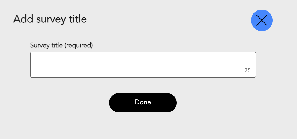
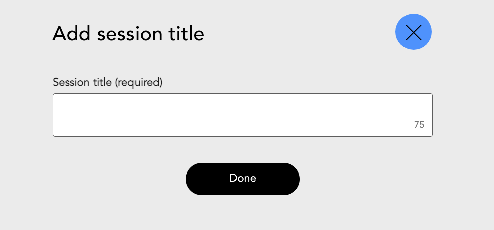
Most users were able to complete the tasks with little to no help from myself. In the 3 test that were done, 2 participants got stuck at the same part and we’re confused about what the difference was between 2 screens where it looked as though we were asking the same question. (see the following screenshots.) The survey title appeared at the very start of the flow when a user attempted to create a new survey, once they entered a title, they would proceed into the survey builder where they would be able to add their questions. However, once the questions were added and they were ready to send out their survey, they would hit send and see the screenshot on the right prompting them to add a session title. This was confusing, most thought they already added a title for the survey and didn’t realize that the session title would be different than the survey title.
Add survey title that appears on creation of a new survey
Add session title that appears after the survey is created and user is sending it out to a batch of participants.
What did we change?
Based on the feedback from the user testing, we decided to make a change to the session title screen. We added some text to help distinguish the purpose of this screen and how it differs from the initial title screen.
What users see now when they are sending out a survey.
Final Results
Patient feedback:
"Overall experience was wonderful. Special app for information and videos was a great tool. I would recommend to anyone."
‘it was an easy experience”
I wouldn’t change a thing. The whole experience put me at ease and was very professional!
Feedback from testing:
Throughout this week long testing schedule we had asked our participants to write down any issues they ran into while completing their surveys. With this we were able to catch and fix a lot of errors that could have otherwise been missed.
Data insights
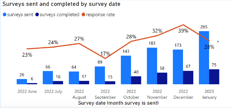
A few months after the release of our surveys feature we were able to see some actionable data from our customers.
Surveys sent and completion rate as of Dec. 2022.
Pre-op response rate as of Dec. 2022
Surveys sent and completion rate as of January 2023. The overall number of surveys completed has gone up.
Pre-op response rate as of January 2023. We exceeded our estimated February benchmark.


